Overview
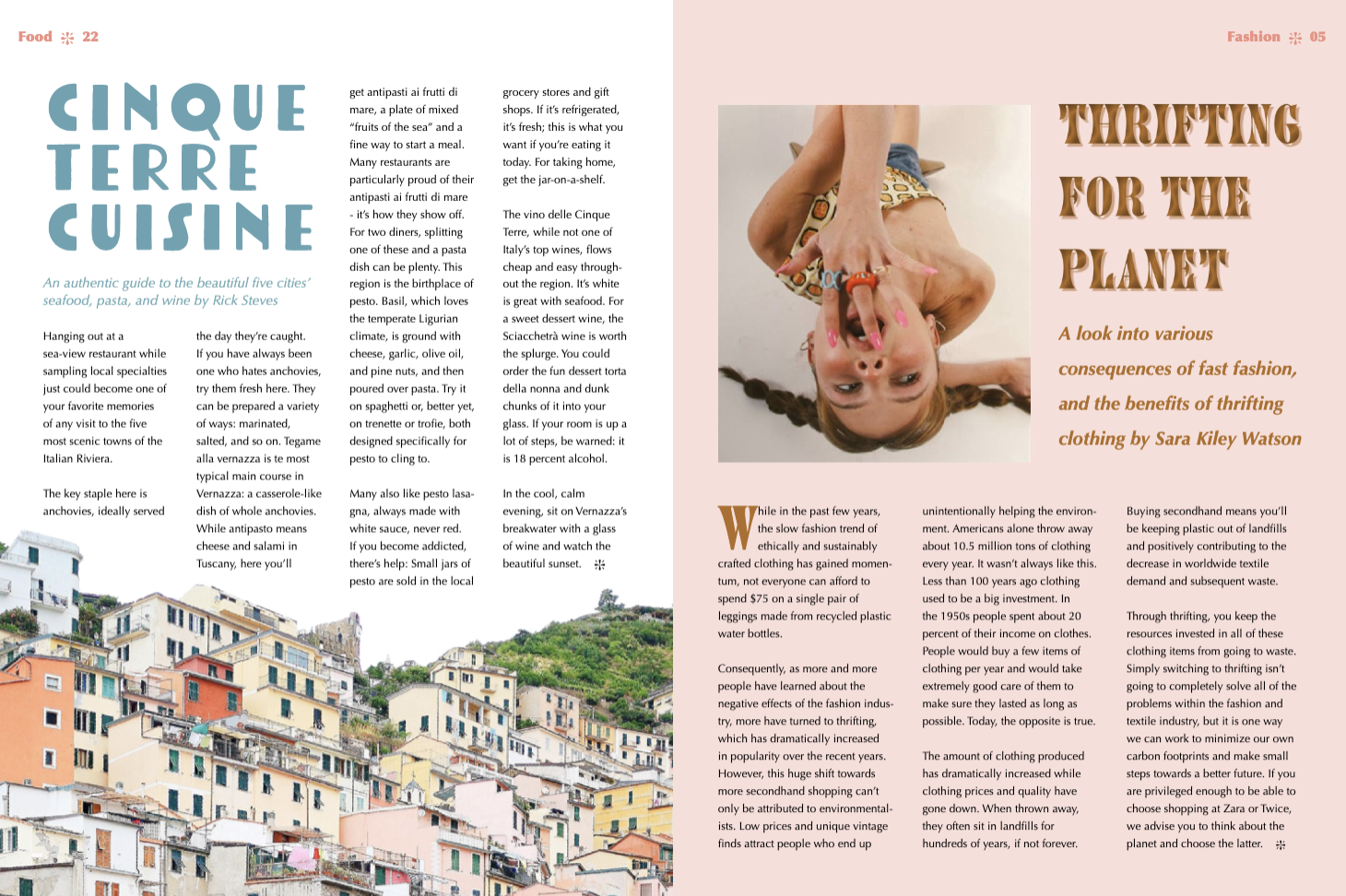
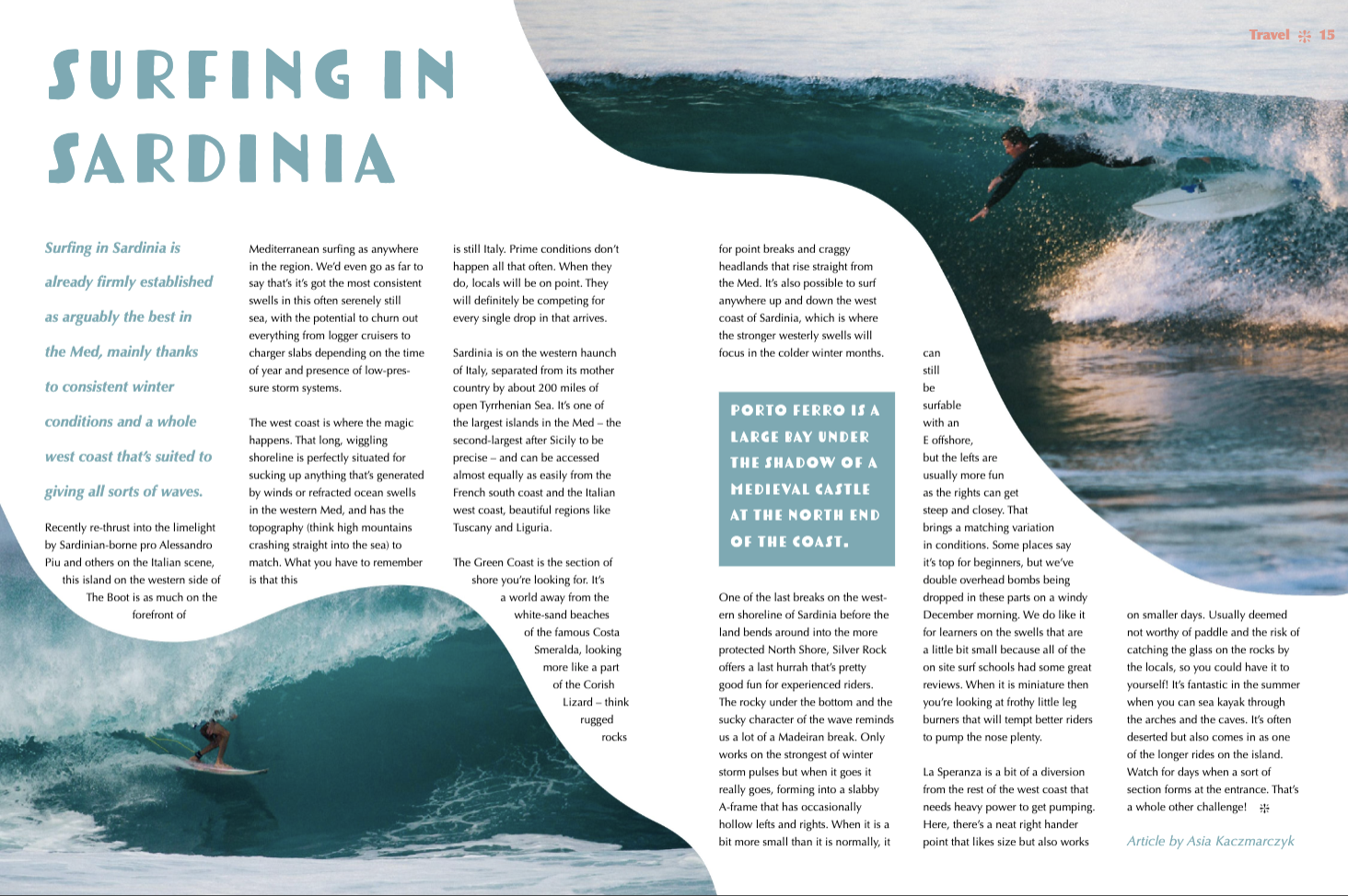
For one of my classes at Cal Poly, my classmates and I created and published a magazine - each of us designing an 8-page spread. These 8 pages were required to include a front cover, a contents page, a credits page, a 2-page spread, two 1-page spreads, and a back cover featuring an advertisement. All of the content and design choices had to be cohesive and directed towards a specific target audience.
I decided to create a food, travel, & lifestyle magazine for teens and young adults which featured articles about fun things to do in new places, foreign meals to try, and pretty much anything fun, captivating, and adventurous. I wanted to bring the excitement back to print in a world of digital media.

Idyllic Magazine SPread Design
Process
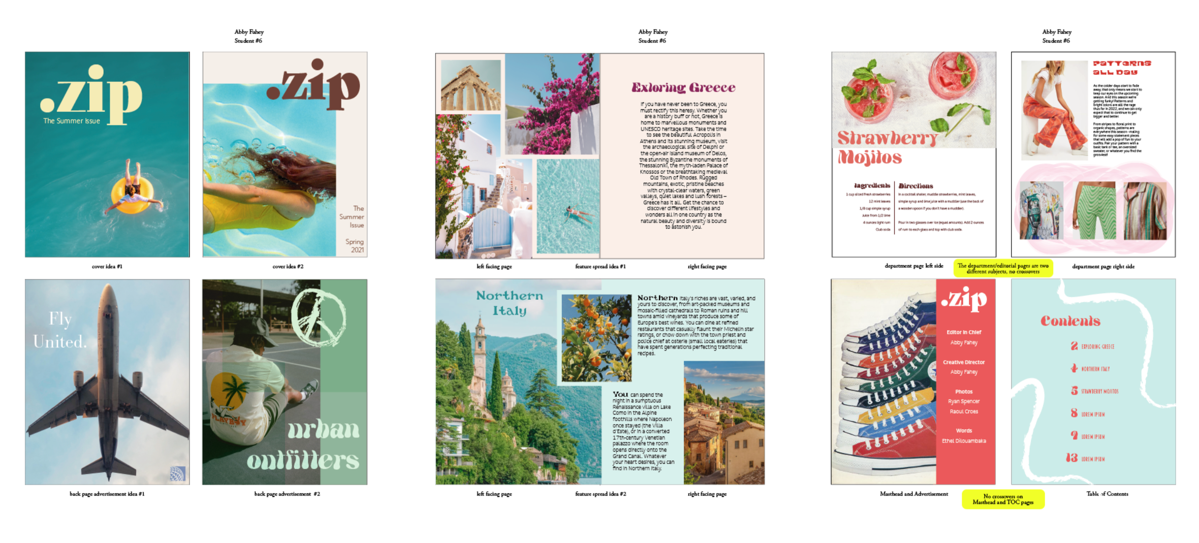
My classmates and I regularly participated in reviews and critique sessions - with each other, as well as locals in the graphic design industry who provided some invaluable advice.
This was a fun way to get directional feedback from a bunch of talented designers, and gave me the chance to speak up and give my peers some outside perspective on their spreads. I learned how important it is to get as many eyes as possible on your designs, ensuring you aren’t too locked in on your own aesthetic.
Since everyone took different directions with their design choices, it was really fun and interesting to watch all of our unique paths of progression.

Results